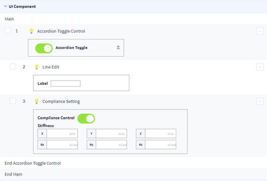
Accordion Toggle Control
The function of Accordion Toggle Control Component is as below.
- It hides/shows lower components when needed by the user.
- It is enabled and disabled according to the status of the toggle button of the lower component.
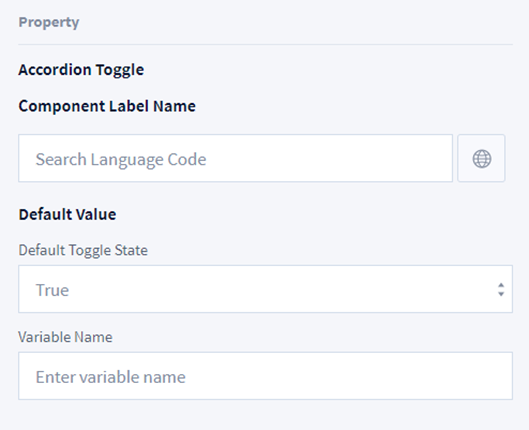
The setting information of Accordion Toggle Control Component is as below.
- Component Label Name: Set the label name. Select the icon on the right to set the multi-language code.
- Default Value: Set the default value of the toggle button.
- Variable Name: Set the variable name with the value of the toggle status.